
A clear typographic hierarchy is critical to effective communication. Type should be light and well-spaced. It should promote readability and accessibility, which allows all users to efficiently read and absorb textual information. This system uses weight, scale, and capitalization to convey the relative importance of each heading within a document.
Visual Identity
Typography
Typefaces
For information about how our typography is implemented, please visit the Typographic Hierarchy page. For information about accessibe text color combinations, please visit the Text Contrast page.
Using these Typefaces
Instructions for using these typefaces are available on the Assets: Fonts page.
Trajan Pro
Trajan Pro is used for headings, and connects the page content with the MAX.gov logo branding. As implemented, Trajan Pro is entirely small capitals.
Trajan Pro may be used for introductory or accent text. For example, Trajan Pro is well-suited for use in menus or labels.
The Trajan design is a serif font with elegant, sweeping curves and due to its Roman typography inspiration is consequently an upper-case only font family. The Trajan typeface family was originally designed by Carol Twombly and released in 1989 by Adobe Systems Inc.
Trajan Pro Bold
ABCDEFGHIJKLMNOPQRSTUVWXYZ
abcdefghijklmnopqrstuvwxyz
0123456789
Trajan Pro Regular
ABCDEFGHIJKLMNOPQRSTUVWXYZ
abcdefghijklmnopqrstuvwxyz
0123456789
Open Sans
Open Sans is our default base typeface, used for just about every UI element down to body text.
Open Sans is excellent for any type of use. It’s incredibly readable in small sizes and also works great when printed in huge letters.
Open Sans is a humanist sans serif typeface designed by Steve Matteson, Type Director of Ascender Corp. Open Sans was designed with an upright stress, open forms and a neutral, yet friendly appearance. It was optimized for print, web, and mobile interfaces, and has excellent legibility characteristics in its letterforms.
Open Sans Bold
ABCDEFGHIJKLMNOPQRSTUVWXYZ
abcdefghijklmnopqrstuvwxyz
0123456789
Open Sans Regular
ABCDEFGHIJKLMNOPQRSTUVWXYZ
abcdefghijklmnopqrstuvwxyz
0123456789
Open Sans Light
ABCDEFGHIJKLMNOPQRSTUVWXYZ
abcdefghijklmnopqrstuvwxyz
0123456789
Readability
Readable text allows users to efficiently read and take in textual information. Text that is not readable turns off readers or makes it challenging for them to stay focused. The following guidelines promote good readability.
Alignment
Typography should be set flush left. This provides the eye a constant starting point for each line, making text easier to read.

text-align: left;Line Height
Ample space between lines of type promotes an open feeling and lends flow to body copy.
When setting body copy, the leading should be 1.6 times the type size, or 60% larger.
26px font size

16px font size
/* 26px font size */
font-size: 26px;
line-height: 42px;

/* 16px font size */
font-size: 16px;
line-height: 25px;
Line Length
Comfortable line length allows the user’s eyes to flow easily from the end of one line to the beginning of the next.
For a single column of text, line length should be an average of 66 characters per line, including spaces, but may range from 50 to 75 characters.

max-width: 35em;Spacing
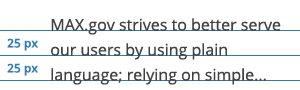
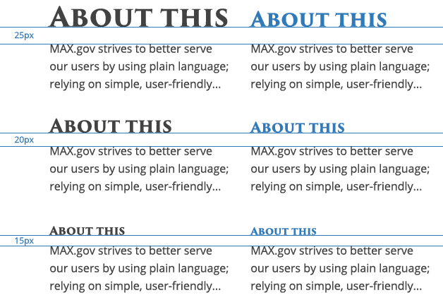
White space or blank space affects how the user focuses their attention on the content. It makes it easier to know what to read and where to begin. Spacing between typographic elements should be open enough to feel light, but close enough to establish a proper relationship between elements.
When setting headers and body copy, the white space should be 15px, 20px, or 25px.
h1,
h2 {
  margin-bottom: 25px;
}

h3,
h4 {
  margin-bottom: 20px;
}

h5,
h6 {
  margin-bottom: 15px;
}