Visual Identity

Branding

Logos

There are several versions of the MAX.gov logo.

Using these Logos

You can link to or download these logos on the Assets: Images page.
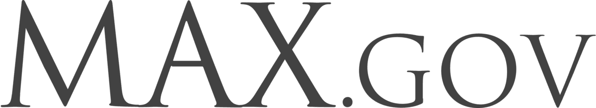
Wordmark

MAX.gov

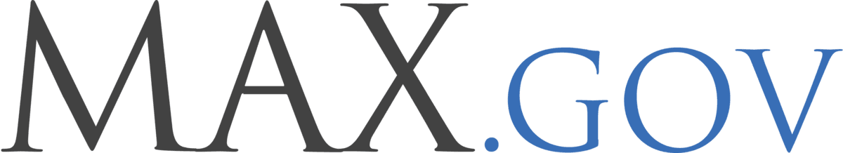
The MAX.gov wordmark is set in Trajan Pro by Adobe.

The Trajan design is a serif font with elegant, sweeping curves and due to its Roman typography inspiration is consequently an upper-case only font family. The Trajan typeface family was originally designed by Carol Twombly and released in 1989 by Adobe Systems Inc.

Seal

MAX.gov

The MAX.gov seal is derived from the Great Seal of the United States.

The most prominent feature is the American bald eagle supporting the shield, or escutcheon, which is composed of 13 red and white stripes, representing the original States, and a blue top which unites the shield and represents Congress. The motto, E Pluribus Unum (Out of many, one), alludes to this union. The olive branch and 13 arrows denote the power of peace and war, which is exclusively vested in Congress. The constellation of stars denotes a new State taking its place and rank among other sovereign powers.

Lockups

Horizontal Lockup

MAX.gov

The horizontal lockup is the primary option and appears on our stationery and website.

Vertical Lockup

MAX.gov

The vertical lockup is useful for square frames or narrow columns.

Variations

Small Execution

MAX.gov

The small execution lockup is used when the logo needs to scale down to less than ¾” or 54 pixels at 72 dpi. The small execution logo allows “MAX.gov” to remain legible.

Isolated Seal

MAX.gov

The isolated seal can be used in limited situations, such as a website favicon.

Isolated Wordmark

MAX.gov

The isolated wordmark can be used in limited situations where “MAX.gov” conveys enough information for the given context.

Monochrome Isolated Wordmark

MAX.gov
MAX.gov

The monochrome isolated wordmark can be used in limited situations, and can be reversed when necessary as long as the text is legible on the background color.

Stylistic Guidelines

Clear Space

Horizontal Lockup
Clear Space — Horizontal Lockup 1
Clear Space — Horizontal Lockup 2
Vertical Lockup
Clear Space — Vertical Lockup 1
Clear Space — Vertical Lockup 2

There should always be ample space around the logo to ensure maximum impact and keep the mark from looking cluttered.

As a rule of thumb, ensure that there is an amount of white space equal to the capital M in MAX.gov around the logo, as shown here.

Print Scale

Horizontal Lockup
Print Scale — Horizontal Lockup
Vertical Lockup
Print Scale — Vertical Lockup

The horizontal or vertical lockup should be used for most print applications. These are our benchmark sizes for 8½ ✕ 11” documents, including reports, brochures, powerpoints, and forms. For large-format print pieces, such as posters and banners, where the logo is used with a height greater than 1”, it should be used in increments of ½”.

Complex Backgrounds

Complex Backgrounds 1
Complex Backgrounds 2
Complex Backgrounds 3

The full logo should be shown on a white background for optimal appearance. When this is not possible, the logo must be contained in a white rectangle equal to the required clear space.

Note

The Monochrome Isolated Wordmark can be used on a non-white background, as long as the appropriate contrast level is present.

Examples of Misuse

Stretching

Don’t stretch or condense. This weakens the brand.

Stretched Logo 1
Stretched Logo 2

Shadows

Don’t apply a drop shadow.

Logo with Drop Shadow

Rotating

Don’t rotate the logo.

Rotated Logo 1
Rotated Logo 2

Colored Backgrounds

Don’t place the full logo directly on a colored background or photo without a white bounding box.

Logo on Colored Background 1
Logo on Colored Background 2